

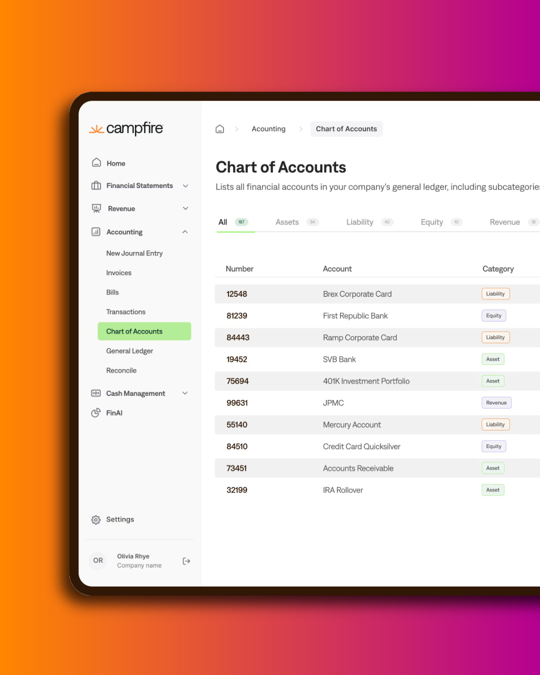
Nobody designs a bad chart of accounts. They accumulate. Every reporting request that the system could not answer added an account, and three years later there are eight hundred of them and nobody can define forty percent.
The fix is not tidying. It is understanding why accounts multiply in the first place.
An account should answer one question: what kind of transaction is this? Salaries. Rent. Software subscriptions. Revenue.
A dimension answers a different question: who, where, or what does it relate to? Which department. Which region. Which product. Which entity. Which customer.
When a system supports only one or two dimensions — Xero's two tracking categories are the common Australian example — finance teams have nowhere to put the others, so they encode them into the account code. You get:
Four accounts for one concept. Add a department and you add four more. Add a region and you double. This is why charts of accounts grow geometrically while businesses grow linearly.
Accounts describe the nature of the transaction. Dimensions describe its attributes. One account called Salaries and wages, tagged with department, entity, region and cost centre, replaces the sixteen accounts you would otherwise need — and lets you report by any combination without creating anything new.
This is the main practical benefit of a multi-dimensional general ledger, and it is worth more than most of the features that get demonstrated.
Start from the reports you have to produce. Statutory accounts, board pack, investor reporting, departmental budgets, unit economics. Work backwards to the minimum structure that produces all of them.
Keep the account list short. Most growing software companies need somewhere in the range of 100 to 200 accounts. If you are heading past 300, dimensions are probably doing the wrong job.
Design dimensions deliberately. Typically entity, department or cost centre, region, product line, and sometimes customer or project. Each should have a clear owner and a rule for when a new value is created.
Leave numbering room. Gaps between account codes so related accounts can be added without renumbering.
Write the definitions down. Every account gets a one-line description of what belongs in it and what does not. This is the single highest-return piece of documentation a finance team can produce, and almost nobody does it.
Cost of revenue versus operating expense. Where hosting, customer success and support sit determines your gross margin. Investors will ask, and changing it later makes your historical margin trend meaningless. Decide early, document the reasoning, be consistent.
Capitalised development. If you capitalise development costs, the chart needs to support the capitalisation, the amortisation, and reporting both with and without it. Retrofitting this is unpleasant.
Entity alignment. Every entity in the group should use the same chart. Different charts per entity means mapping at consolidation, forever — a point we make in the data problems to fix before a migration.
Revenue granularity. Separate accounts for subscription, usage, professional services and other revenue. You will need this for AASB 15 disaggregation disclosures and for any investor conversation.
Rebuilding a chart of accounts is disruptive, so the honest answer is: at a migration, or not at all for a while.
A system change is the natural moment. You are remapping everything anyway, historical comparatives are being restated as part of the project, and the team is already engaged. Doing it as a standalone exercise costs almost as much and delivers the benefit later.
If a migration is not on the horizon, the interim move is to stop the growth: define the accounts you have, freeze new account creation behind approval, and route new reporting requests to dimensions where the system allows it.
Chart of accounts design is the first workstream in our implementations, before any configuration. It is the decision that determines whether the reporting layer works, and it is very difficult to revisit once transactions are flowing.
Get in touch if you are planning a migration and want the structure right before the data moves.